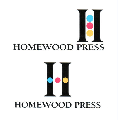
HOMEWOOD PRESS
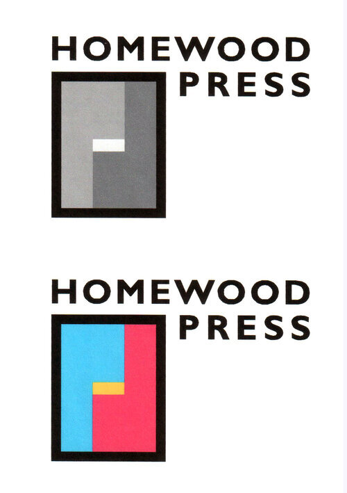
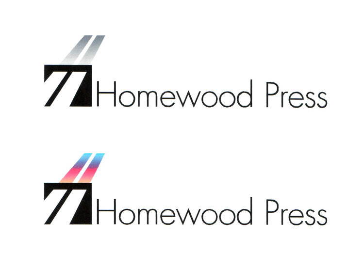
When I met with Homewood, the input they provided that stuck with me the most was, “We don’t try to do it all, but what we do, we do well.” The tagline that supports the Homewood logo is, “Less is more.” Since they’re a printing company, I designed the identity system to have more than one color scheme – why not? – it’s just ink on paper.
My role: concept, design, tagline and print production.
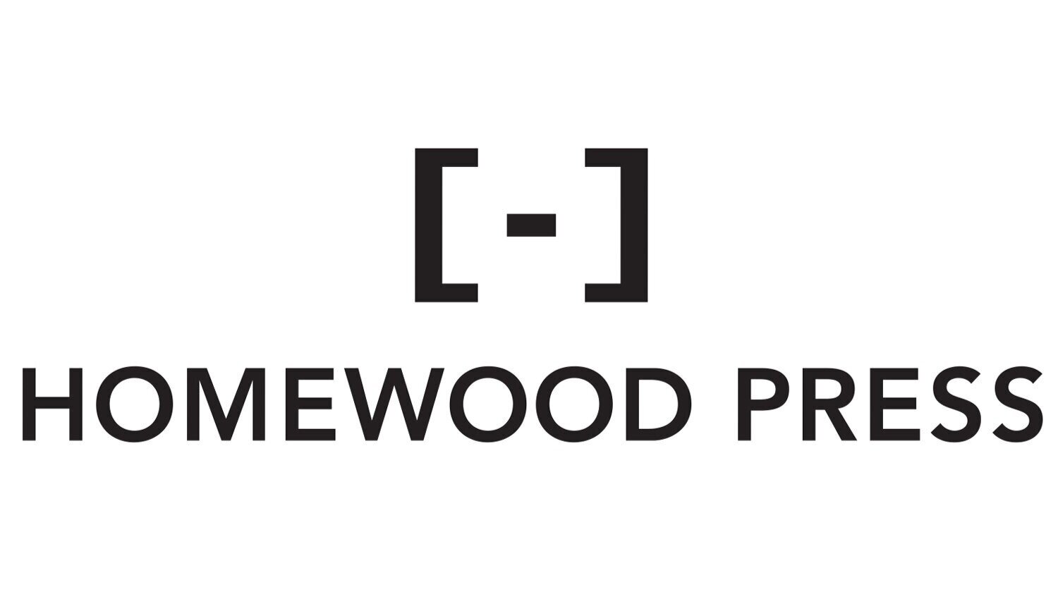

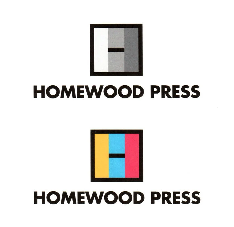
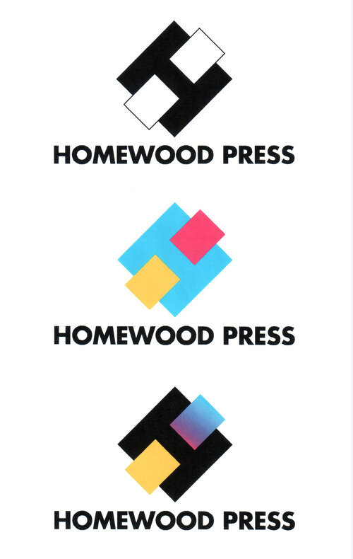
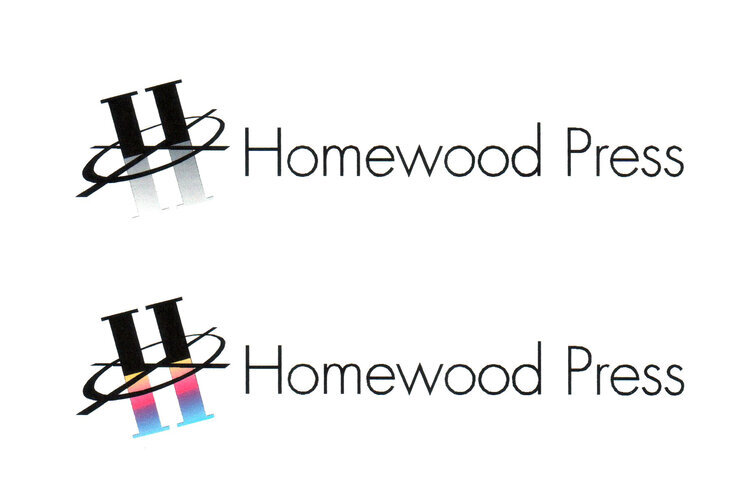
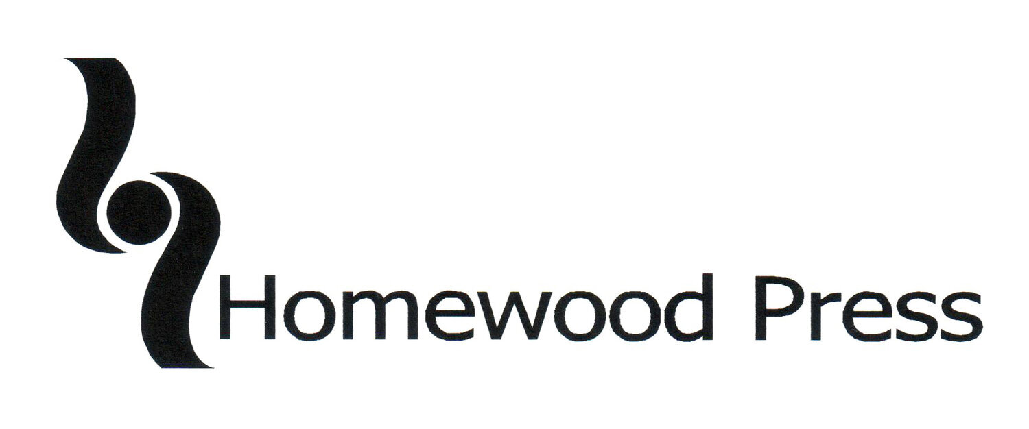
Below are alternate designed logos for Homewood Press.